Delivering a project within a fixed budget is not easy. A burndown chart helps you see if you’re staying within the allocated hours or not.
But how do you make a burndown chart?
That’s what you’ll learn in this article. We’ll walk you through the steps, provide the exact formulas needed, and share a ready-to-use template.
What is a Burndown Chart?
A burndown chart is a simple graph that shows how many hours have been used (or “burned”) compared to the total planned hours for a project.
It gives you a clear picture of progress over time, helping you see if you’re on track to finish within the time budget.
The chart usually has time on the x-axis and remaining hours on the y-axis, with a straight line representing the ideal pace: steadily “burning down” hours to zero by the end of the project. You can then plot your actual progress against this line to quickly spot if things are off track.

The name “burndown” comes from the idea of “burning” hours as you work through the project.
This type of chart is useful because it lets you keep a close eye on your time budget.
The more closely you monitor it, the faster you can spot and fix problems—like using up hours too quickly—before they get out of hand.
If you don’t track your hours closely, you risk burning through them faster than planned. This can lead to running out of hours, overspending your time budget, or having to work extra hours that can’t be billed to the client.
A burndown chart helps you avoid these issues by showing, in real-time, whether your team is staying on track with the plan.
When Do You Use a Burndown Chart?
A burndown chart is especially useful when working on a fixed budget.
Take as an example a digital agency. Apart from running client projects, they are also working on monthly client retainers. A retainer may include 70 hours of work each month that the agency is providing for the client. So the team needs to ensure they don’t exceed this limit. Every hour burned affects the remaining budget.
If the burndown chart shows that you’re likely to exceed the 70-hour limit, it gives you an opportunity to take action before the situation becomes a problem. You can proactively reach out to the client to discuss options:
- Adjust the scope: The client might decide to drop or postpone some tasks to stay within the agreed hours, keeping the budget fixed.
- Increase the budget: If the client wants to complete all the planned work, they might agree to buy extra budget (hours) for the month.
By catching these trends early, you avoid surprises at the end of the month and can have an informed discussion with the client, building trust while keeping the project on track.
Data You Need to Create a Burndown Chart
To create a burndown chart, you need a few key pieces of data:
- Total Planned Hours
This is the total number of hours you’ve agreed to work on the project. For example, if you have a 70-hour retainer, that’s your starting point.
- Time Period
Decide how often you’ll track progress. Usually, this is daily or weekly. For a monthly retainer, you might track hours each day. - Hours Worked Each Day
Keep a record of how many hours your team has worked each day. This is the actual time burned on the project. You can get this information from your time tracking system. Make sure to exclude non-billable hours which don’t count against the budget.
That’s everything you need to build your chart!
Creating the Burndown Chart
Step 1: Preparing the Logged Hours
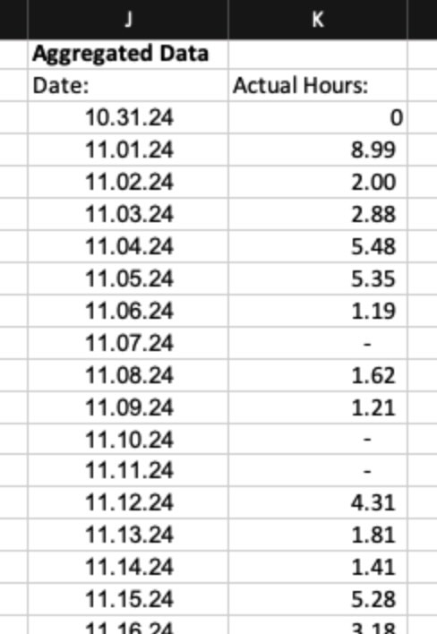
We’ve pulled the logged hours directly from our time tracking system. This data shows how much time each team member worked on the project during November. It includes details like the date, the task they worked on, and the number of hours logged for each entry.
The output looks like this:

Our goal is to create a burndown chart for November to find out whether we’re staying on track with the planned hours for the month.
Before we can create the chart, we need to process this data. Since there are multiple time log entries for each day, we’ll need to aggregate the hours to calculate daily totals:
This step is necessary for building a useful burndown chart.
Step 2: Aggregating Logged Hours Per Day
In November, we have multiple time log entries for each day. To calculate the burndown rate, we need to know the total hours worked each day. This means we need to add up all the hours logged on the same day.
By aggregating the hours per day, we can get a clear picture of how much time was spent daily. This is important because the burndown chart works on a daily level. Without daily totals, it’s hard to track progress or compare actual hours to the planned burn rate.
To sum up the hours for each day, we use the SUMIF function in Excel. This function adds all the logged hours that match a specific date.
- Set up your data: Make sure your time log entries include a column for the date and a column for the logged hours.
- Write the SUMIF formula: Use the formula to sum the hours for each date. For example:
=SUMIF(DateColumn, “11/01/2024”, HoursColumn) - Replace DateColumn with the range of cells containing the dates, and HoursColumn with the range of cells containing the logged hours. Adjust the date in the formula for each day.
- Repeat for each day: Copy or adjust the formula to calculate totals for every date in November.
Step 3: Building the Burndown Table
To create the burndown chart, we need to set up a simple table. This table will help us compare how many hours we should be spending each day to how many hours we’re actually spending.

Here’s how the table is set up:
- Days of the Month
The first row lists all the days in November, from 1 to 30. These are the dates we’ll track. - Ideal Hours Logged
The second row shows how many hours we should log each day to stay on track. For example, if the plan is 100 hours for the month, divide 100 by 30 days. That gives about 3.33 hours per day. This row stays the same for every day because it shows the planned pace. - Actual Hours Logged
The third row shows how many hours were actually logged on the project each day. We use the daily totals we calculated earlier for this row. These numbers can change a lot from day to day. - Percentages: There are some percentages included in the table to show our performance. We’ll explain these percentages in detail later.
- Remaining Ideal Hours
Below the logged hours, we add a row to count down from the total planned hours (100 in this case) to zero. Each day, we subtract the ideal hours (e.g., 3.33 per day) from the total, creating a downward slope that represents the ideal “burn down.” - Remaining Actual Hours
Next, we do the same for the actual hours. We subtract the logged hours day by day from the total planned hours. This creates a line that shows the actual progress toward completing the work.
With this table, we can compare the planned pace to the actual work. This helps us see if we’re ahead, behind, or right on track. Once the table is ready, we can use it to build the burndown chart.
Step 4: Creating the Burndown Chart
Now that the table is ready, it’s time to create the burndown chart. Here’s how to do it in Excel:
- Select the Data
Highlight the row of dates at the top of your table. Then, highlight the rows for “Ideal Hours Remaining” and “Actual Hours Remaining.” These are the rows you want to include in the chart. - Insert a Line Chart
Go to the Insert tab in Excel. Choose a line chart and click. That’s it! The burndown chart will appear, showing both the ideal and actual lines. - Name the Lines
To make the chart clearer, give each line a name:- Right-click on the “Ideal Hours Remaining” or “Actual Hours Remaining” line.
- Choose “Select Data” from the menu.
- Under the name field, select the correct row title from your table (e.g., “Ideal Hours Remaining” or “Actual Hours Remaining”).
- Your Chart Is Ready
Now your burndown chart is complete! It shows the ideal burn rate as a straight line and the actual burn rate as a changing line.
Updating the Chart
In this example, we made a chart for the whole month of November.
But in practice, you’d start the chart at the beginning of the month.
Each week, you’d add the latest logged hours to the table and update the chart. This helps you see how well the project is sticking to the plan and fix issues early if needed.
How To Read the Burndown Chart
The burndown chart shows two lines:
- Ideal Hours Remaining: This is the straight line that represents the planned pace. It shows how many hours should be left each day if you’re on track.
- Actual Hours Remaining: This is the line that changes day by day. It shows how many hours are actually left based on the time your team has logged.
If the Actual Hours Remaining line is below the Ideal Hours Remaining line, it means you’re below budget—you’ve burned fewer hours than planned and have extra time available.
If the Actual Hours Remaining line is above the Ideal Hours Remaining line, it means you’re behind schedule—you’ve burned more hours than planned and might risk running out of time.
The goal is to keep the actual line close to the ideal line. If there’s a gap, it helps you quickly see whether adjustments are needed to stay on track.
Be careful when interpreting the chart!
If the Actual Hours Remaining line is above the Ideal Hours Remaining line, it might look like a bad thing. But that’s not always true. It could mean the team is ahead of schedule and completing tasks faster than expected.
On the other hand, if the Actual Hours Remaining line is below the Ideal Hours Remaining line, it might seem like everything is going perfectly. But it could also mean the team is working slower than planned, which might lead to delays later if the pace doesn’t improve.
Both cases need a closer look to understand what’s really happening.
Summary
A burndown chart helps track how much work is left compared to how much time or budget is available. It’s a simple way to see if your project is on track.
Burndown charts are most helpful when you need to monitor progress regularly, like making sure your team is staying within a monthly budget. By checking the chart often, you can quickly spot if things are going off track and make adjustments.
But numbers alone don’t tell the whole story. Always check what has actually been delivered and the progress your team has made. If something looks off on the chart, talk to your team to understand why. The chart is a tool to reveal trends, but real conversations will tell you what action you should take.
Download the Burndown Chart Template here